
A kinetic typography film for Uber, using animated text, bold graphic compositions and minimalist motion design to explain how dynamic pricing responds to demand, distance and time.
Uber - Kinetic Typography Explainer Video
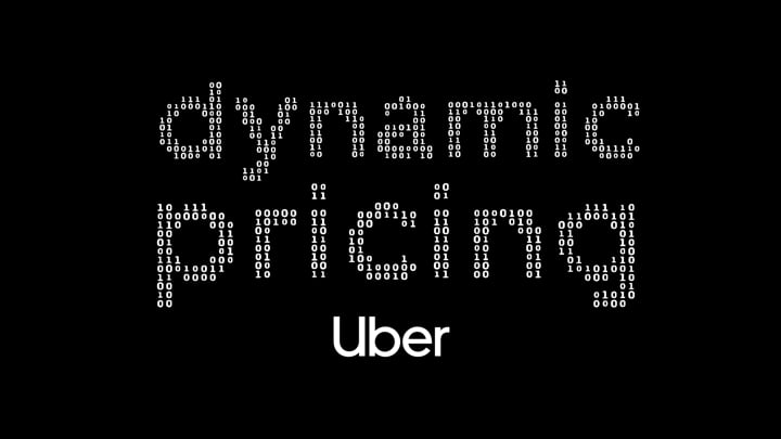
Explaining Dynamic Pricing Through Motion
Uber's pricing system responds to a constantly changing combination of factors, including demand, distance and time. To make this automated process easier to understand, Wideview created a kinetic typography video that transforms technical information into a clear, engaging visual narrative.
The creative challenge was to explain a system driven by data without overwhelming the viewer with numbers or technical details. Rather than relying on conventional diagrams or character animation, the film places typography at the center of the story, allowing words, symbols and movement to communicate how pricing changes in real time.

When Typography Becomes Storytelling
In this film, typography does more than deliver information. Words appear, shift, expand and reorganize to illustrate the factors influencing Uber's pricing system. The relationship between text, timing and composition creates a visual rhythm that helps viewers follow the explanation naturally.
The animation uses changes in scale, position and pace to establish hierarchy and emphasize important ideas. By giving each movement a specific purpose, the film turns abstract pricing mechanisms into a sequence of visual interactions that feels both intuitive and dynamic.


A Minimalist Design with Maximum Impact
The visual direction follows Uber's clean, recognizable identity, built around bold typography, simple graphic elements and a predominantly black-and-white palette. This restrained approach keeps the focus on the information while allowing the animation to introduce energy and variation through movement.
Numbers, words and graphic shapes become flexible design elements, transforming from one composition to another as the narrative progresses. The result is a visual language that remains consistent throughout the film while giving each concept its own distinctive treatment.


Designing a Consistent Motion Language
Beyond individual sequences, the project required a coherent motion design system capable of connecting different ideas within a single visual narrative. Typography, transitions and graphic elements were developed to work together, creating continuity between the film's explanations of demand, timing and automated pricing.
The finished animation demonstrates how a limited set of visual elements can support surprisingly rich storytelling. By combining typographic precision, thoughtful pacing and a clear narrative structure, the film makes a complex digital process easier to understand without sacrificing visual character.

Send us your info and a few details about your project.
We’re ready when you are.
Let’s talk?


325 Hudson St 4th Floor
New York, NY 10013
© - Wideview - All rights reserved - 2026
+1 (646) 583-3404